Website Dark Mode has moved from a passing trend into mainstream demand in today’s digital user landscape. This mode flips the color scheme to darker shades, thus enabling a set of advantages that include increased user engagement and website performance. In this article, we are going to talk about the impact of Dark Mode on the user’s experience, why it is a must-have feature for modern websites, and how Orthoplex Solutions has successfully integrated it into recent projects for clients. But first, let’s take a closer look at what it is:
What is Website Dark Mode?
Dark mode refers to that setting of display, by which the color changes from bright and white backgrounds of the screen to dark. It is a very popular user interface preference since users find this dimmer setting more comfortable, especially in a low-lighted area. Here, the background goes dark; text and icons are in lighter colors, such as white or light gray.
This switch not only relieves eye strain, particularly for those who spend extended amounts of time on a screen, but it is also quite visually more attractive for most people and easier to read. Secondly, this feature provides better battery life for screens using OLED and AMOLED technology, providing users with added value on a functional level also.
In case you are unfamiliar with OLED, it is an organic Light Emitting Diode, while AMOLED is an Active Matrix Organic Light Emitting Diode. They are types of display technologies used in modern screens such as smartphones, televisions, and smartwatches.
Either due to its aesthetic appeal or because of its functionality, dark mode is becoming a feature that no digital platform can overlook.
The next thing we move to is why it is important; what is special is that the users are looking for it on each and every website. Here come all the answers to those questions.
Why Dark Mode is Important for Modern Users
Reduced Eye Strain
Among the most sizable advantages of Dark Mode is its tendency to reduce eye strain. For those who work, browse, and game on the screen for hours, bright high-contrast displays in light mode can cause discomfort, especially when the environment is not very well-lit. The intense brightness of white backgrounds when working late or reading in the evening may cause eye fatigue or even headaches.
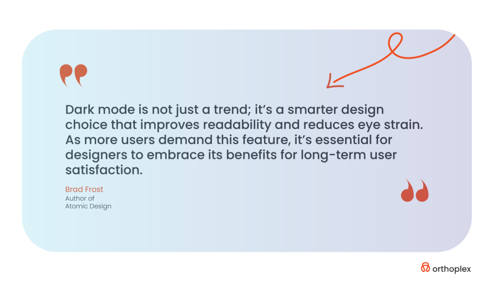
On the contrary, Website Dark Mode uses softer tones and dimmed brightness levels; hence, such issues are avoided. It has been proven that a bright screen if used for an extended period of time, can lead to computer vision syndrome, which includes but is not limited to blurred vision, headaches, and dry eyes. Dark mode provides a darker background that will enhance user comfort and help reduce the possible negative impact on eye health in the long run. This surely will be the case for night owls, binge-watchers, and late-night readers.
Extended Battery Life
In today’s mobile world, one of the primary concerns of users is battery life. In all, the dark mode contributes a lot to saving the battery, especially for those devices with OLED and AMOLED screens. The OLED screen turns on every pixel differently than the traditional LCD, which always keeps the backlight on. This means that the dark pixels use less energy to display anything.
If a big part of the screen is black, then the device consumes less power; hence, a more efficient way to use the battery. Whether professionals, travelers, or any person needing extra time from their batteries, dark mode can be a godsend. In fact, a recent study published by Poweringautos, has calculated that on some screens, the power consumption could be reduced as high as 60% with Dark Mode. This means a huge practical advantage of power-saving capability since most need to get their devices to last them throughout the day without needing to look for a charger now and then.
Improved Focus and Aesthetics
Website dark mode isn’t all about practicality; it is about aesthetics too. A well-implemented design for dark mode creates a sleek, calm, and modern environment. Many users reported that the darker theme minimizes visual distractions and really lets them focus on the content itself much more. This is most vital for content-heavy platforms, such as e-readers, messaging apps, and even coding environments, where readability and minimal distraction are critical. For example, dark backgrounds with light-colored text create a great contrast in which legibility improves for the easier reading of information.
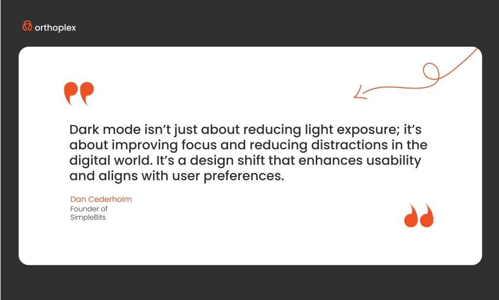
This is further emphasized by the fact that dark mode exudes a sophisticated look of modernity. In this case, it brings a sense of class and minimalism, which many users and brands in the modern world would easily relate to or be eager to be associated with in brand identity. Most brands use dark themes for better immersion, such as Netflix and Spotify. It gives more emphasis to the visual elements such as buttons, images, and typography.
The use of website dark mode, therefore, can be integrated into the design to increase users’ interactions in general, reduce visual fatigue, and provide a better experience for its audience.
Website dark mode is something more than a design trend; it’s a must-have feature, coming with considerable advantages for both users and performance. It saves everything from eye strain to battery life and improves focus. Dark mode is here to stay. We at Orthoplex Solutions believe in user-oriented design and have incorporated smooth toggling into dark mode into most of our recent works. This all adds up to a much more refined user experience, comfort-focused, and performance-oriented.
So, if you’re ready to boost your user experience and improve your engagement, let’s discover the best practices of website dark mode for your online presence.
10 Website Dark Mode UI Best Practices & Principles
Dark mode is a night-friendly UI design style predominantly featuring dimmed, dark, and gray color themes for all UI elements. This design style is said to be “night-friendly”; in the case of darker colors, less light is reflected out. Less light means less glare off the screen. Sometimes, toggling on the ‘dark mode’ provides much-needed relief in low-light environments when your eyes ache from staring at bright screens. And that’s probably why “dark mode” has gone beyond just a design style. Dark mode has now become the default feature on many applications and websites which users can always switch whenever they feel tired of using the standard “light theme.”
Twitter was one of the pioneers in the UI design trend that is known as dark mode; it released in 2016. The app still allows users to switch from light to dark mode at will.
Following are some of the best practices that professional UI designers keep themselves engaged in, to avoid all the pitfalls mentioned above and seamlessly integrate dark mode into their app or web designs.
Avoid Pure Black
Use a dark gray like “Cod Gray” (#121212), instead of pure black (#000000). That softer color will reduce harsh contrast and eye strain for a more comfortable visual experience.
Limit Saturation
Bright, vivid, saturated colors can be overwhelmingly bright in Dark Mode. Less saturated hues should be used to retain the balance needed to make something easy to read in a design.
Not Pure White
Too much glare and bright white elements may hurt someone’s eyes in Dark Mode. An off-white shade keeps text and other elements more visually comfortable.
Brand Custom Dark Mode
Instead of using standard gray or black, apply a darker color from your brand for the background to increase originality and maintain brand identity.
Inversion Doesn’t Work
Just inverting all colors within a light-mode design simply doesn’t work. It needs to be treated differently in dark mode because different strategies and color palettes will be in play to ensure readability and visual attractiveness.
Convey Depth, Not Shadows
Many times, dark mode and shadows just don’t mix. Use lighter fills and borders to provide both hierarchy and a sense of depth instead.
Use Saturated Text Colors
Using pure white on black is something that should be avoided. It needs to be changed to an off-white or light color to enhance readability and reduce strain.
Ensure Visible Focus Indicators
Ensure that focus indicators present during keyboard navigation have a good contrast with the dark background.
Use Dark Mode-specific Images
Images should be changed according to the theme. Using CSS media queries, you will need to switch images while toggling between light and dark mode.
Test in Various Lighting Environments
You should always test the design of dark mode in low and high light to maintain consistency in comfort for the user.
These practices help ensure that dark mode is a functional, user-centered part of your web design strategy and not a fad. It will go a long way in ensuring that designers provide better usability, user engagement, and satisfaction. Not only that, but it also makes sure that a certain set of advantages is assured for your users, which they cannot have on other websites sans dark mode.
Benefits of Website Dark Mode for User Experience
Dark mode reduces blue light, minimizes eye strain, and lets users maintain healthier sleep habits; it’s great, especially at night when the rate of usage falls.
Rich color schemes to explore
Dark mode allows designers to use subdued tones and deep hues, adding an extra layer of sophistication to the UI. Light themes generally use brighter colors, while dark mode interfaces allow for unique aesthetic entry.
Both light and dark are supported
While Dark Mode is currently at the top of its hype, it now becomes inclusive by giving users a toggle between light and dark themes; this creates an advantage for flexibility in the case of a lot of user preferences and needs and hence gives enhanced usability.
Person-oriented personalization
Say, that users can add options themselves for dark modes, like changing contrast and a wide range of color palettes- which allows users to create their own experience and, therefore, an improved UX.
Pro-Tip: Website dark mode shall be provided in a balanced manner
Consider the right balance of white space without over-providing the dark elements. This results in an increasingly awesome and user-friendly interface where there will be visual balance.
Screen and Device Compatibility
For continuity and the same experience, the effectiveness of Dark Mode will have to be cross-checked across various devices and operating systems. This needs to be tested across many different devices for seamless integration across multiple platforms.
Better Accessibility
Dark mode can go a step further toward better accessibility, making interfaces more comfortable for those sensitive to bright light. This will be paramount in testing with feedback from users to refine settings further for improvements in accessibility in every way.
Thoughtfully integrating dark mode into UX design is therefore much more than a fad; it is about user health, the ramping up of design capability, and diverse usage contexts for many end users. By paying close attention to readability, customization, and accessibility, designers can deliver attractive user experiences that truly meet the evolving preferences of users.
If you are concerned about the quality, then to keep your website professional in dark mode, you must avoid the following mistakes:
Common Mistakes in Dark Mode Design and How to Avoid Them
Most of the important points to remember in designing a good-quality dark mode involve evasion of certain pitfalls that might just bring down its usability, readability, and aesthetic appeal. Key aspects include the following:
1. Graphics
Transparent backgrounds
Make sure all graphical stuff has a transparent background and most importantly for formats like PNG or SVG. The one with a white background might look alright in light mode; it looks quite awkward in dark mode.
Icons and emojis
Dark-colored icons/emojis disappear in the dark background. Testing of each and every element against light and dark themes for readability.
2. Overlap Depth and Shadows
Creating Depth
Creating depth among elements that overlap one another would require subtle, light-colored shadows or layering effects, since traditional dark shadows simply wouldn’t work on dark-colored backgrounds. For example, the use of lighter shades of gray for the background of “floating” components helps create a hierarchy.

Scrims
Allow dark mode to provide opacity on top of transparent overlays, so text is always readable and read comfortably, such as on top of models.
3. Readability
Font Weight and Contrast
Dark mode tends to swallow thin fonts, while bold fonts seem much thicker than they are. It is always better to stay with middleweight font sizes and test color contrast for better readability. When in doubt, use WCAG contrast ratios of 4.5:1 for text and 3:1 for large text.
Logos adaptation
Sometimes logos need to be only slightly adjusted. These include adding a light-colored outline, or using a dual-color version so that it can be seen in Dark Mode – specifically for the emails opened in either mode.
4. Color Contrast
Saturated Colors
Overtly saturated colors might have merged into the dark backgrounds, hence causing visual fatigue to the viewer. Steer clear of the very intense shades instead and use somewhat less saturated colors to improve readability.
Channel Consistency
Web App Harmony: If your app has Dark Mode, it would be just great if when the user opens the web within an in-app web, that too goes into Dark Mode. Consistency is always key, and switching between native Dark Mode apps and Light Mode web pages is quite jarring.
6. Page Structure and Dividers
Dividers and Borders
Placing them against a dark background, the gray dividers or outlines of medium to thin weight will disappear. A little more subtle color differentiation or thicker borders will facilitate clarity and separation between sections.
Layered Components
Subdivisional areas should have a contrast of colors. A gentle gradient change of background tone will make sections stand out from each other and will help organize information internally which makes it easier for the user to understand.
7. Floating Elements
Especially for floating elements, poor contrast may create an effect of floating buttons or modals bleeding into the background. Therefore, white or light-shaded components will work just fine.
8. Scannable Codes
Scannable codes will probably be inverted when in dark mode, making them unusable under some scanners. A setup should always include readability for both of these modes, such as black on white.
Now, amplify each of these design details to the next level and create an engaging, professional dark mode that exudes a cohesive, very intentional feel. The thoughtful adjustments will make your design visually appealing, accessible, and functional across all platforms and modes.
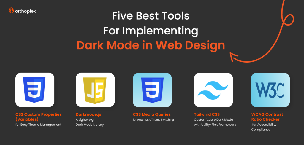
Because it is said easier than actually being so, Orthoplex Solutions gathered for you the five best tools to implement dark mode in web design.
Top Necessary Tools for Dark Mode Designs: Supplies to make creating dark mode easier.
Easy Theming with CSS Custom Properties (Variables)
CSS Custom Properties, commonly referred to as CSS Variables, provide an amazing way to keep and use dark mode. If your color themes are defined in one place, using variables greatly simplifies the process of modifying the look of your whole website by changing only a few key values.
This approach is particularly good when implementing dark mode because it allows quick switching between light and dark themes. For example, this gives a user the ability to easily control themes and even darken the mode by allowing users to have one central point to change the background color, text color, and link colors through CSS Variables.
Darkmode.js: Lightweight Dark Mode Library
It provides an easy, intuitive way to turn dark mode on and off and can remember the user’s preference to automatically apply their theme on return visits. It is especially great for developers who seek a problem-free solution where they would not have to code much or do some difficult settings. With Darkmode.js, adding dark mode takes as little as adding one script on your website with literally a few lines of code.
CSS Media Queries: for Automatic Theme Switching
The CSS media queries can automatically change the look and feel of your website, depending on the system preferences such as light or dark theme. The prefers-color-scheme media query detects whether the user has set light or dark themes in his Operating System/browser and changes the styles respectively. This makes it even easier for users to browse a website in the mode with which they are more familiar without having to interfere with the process manually. This ensures that your site becomes easily adaptable to different environments for a better user experience and accessibility.
Tailwind CSS: The utility-first framework for making it easier to customize dark mode
It gives you a simple system where you can put classes onto elements and it will auto setup light and dark mode display settings. Utility classes within this framework mean control of the dark mode behavior of elements on your site is pretty efficient; just using dark:bg-black for backgrounds and dark:text-white for text makes the implementation of consistent dark mode designs right across a whole site easy to design. The above flexibility and speed make Tailwind a perfect suit for developers seeking customization without having to write custom CSS that’s extensive.
WCAG Contrast Ratio Checker: for Accessibility Compliance
WCAG Contrast Ratio Checker is an important tool in the field of keeping your website accessible, especially when you are about to implement dark mode. WCAG recommends that the contrast ratio should be at least 4.5:1 for normal text and 3:1 for large text so that people with visual disabilities can read them. This tool will help designers check the contrast ratio between text and background colors to see if they meet accessibility guidelines. This tool keeps you far from bad contrast issues. The website is not only friendly to its users but accessible to a wider audience including visual disabilities.
Orthoplex Solutions’ Dark Mode Approach: How We Tailor Dark Mode Features to Meet Client Needs
At Orthoplex Solutions, we cherish user experiences in today’s modern, fast-moving world of digitization. Dark mode has grown organically from a trend to a must-have need for many digital applications with the increasing awareness of user-centric design. We realize that every client’s needs are different and have therefore developed a customized approach toward incorporating dark mode into applications with optimal functionality and aesthetics.
Significance of Dark Mode in Modern Applications
Dark mode is no longer a question of taste; it has become one of the most important features promoting users’ comfort and customer engagement. According to some studies, dark mode may reduce eye strain, especially for users who spend hours in front of their screen. Besides, this feature prolongs battery life for OLED and AMOLED displays while offering a modern and sleek look that appeals broadly across demographics.
Keeping this in mind, dark mode is a high-in-demand feature for clients to make their applications more accessible and user-friendly. A well-implemented dark mode often distinguishes an application from other competitors and raises user satisfaction, which is well-understood at Orthoplex Solutions.
Custom Dark Mode Solutions by Orthoplex
Our process involves an in-depth analysis of the application provided to our client and their user base. This would help in identifying certain needs and preferences, which drive our design for dark mode. Here at Orthoplex Solutions, we pride ourselves in building solutions that are appealing but speak to the functionality of the product.
Customized Aesthetic and Usability
Other basic features of dark mode are one-size-fits-all, while we make sure that the solutions we propose for dark mode take into account every peculiarity of our client’s brand guidelines and user preferences. We pay attention to contrast ratios, color palettes, and readability, so it all looks fine and makes a harmonious and accessible user experience. When we introduce our design team into the process, this close demarcation of key visual elements to be changed according to light and dark mode transition will ensure fluidity and consistency in the user experience.
Smooth Integration with Already Existing Platforms
Orthoplex Solutions’ dark mode solutions are engineered to seamlessly integrate with existing applications. Extensive compatibility testing is conducted to ensure dark mode works as expected across a wide array of devices and operating systems. The aim is to provide a sound feature that adds value without bringing in new challenges or asking for major revamps to the codebase.
Performance Optimization
Our dark mode solutions are created keeping performance in mind. Efficient coding practices are followed to ensure there is no extra load on load time and system resources, so the transition between light and dark mode transitions is smooth without affecting user responsiveness.
Client-Centric Development Process
The integration of dark mode is iterative and very client-oriented. We communicate openly with the clients right from the commencement of the work to the very end and take continuous feedback for refinement of the final product. With a blend of technical know-how, considered design, and dedication towards client satisfaction, Orthoplex Solutions has come up with dark mode features that lie in tune with modern user expectations and give a full digital experience to users.
Final Thoughts on Website Dark Mode
Thus, dark mode has become a must-have element in modern web design. It increases the comfort of users who can then be more active, and gives them a better experience when using the website. In this way, it diminishes eye strain for those users who need to spend extensive amounts of time in front of screens, especially under poor light conditions, and gives them an aesthetically pleasing and less tired-feeling browsing experience. Besides its aesthetic appearance, it keeps offering practical functions to extend the battery life of OLED and AMOLED displays, making it an addition to such a valuable gadget for an end-user who intends to use it effectively for a longer period.
These benefits have been realized by Orthoplex Solutions, which has applied the Dark Mode solution for several clients, each tailored to a respective client’s brand and the needs of its users. Including options for customization and access thoughtfully ensures that dark mode meets and can even exceed user expectations.
With such a fast-evolving user preference and increasing competitiveness in digital platforms, dark mode will also be one of the major reasons for user retention and satisfaction in the future. The developer or designer can create an inclusive and effective digital experience by focusing on the user-centered design principle to meet diverse user habits and preferences. It is much more than a design trend to incorporate dark mode thoughtfully and strategically; it represents a key area of modern web development, keeping functionality and user health in mind.

