

Imagine losing 11% of your revenue because your web app, the tool your customers use in their browsers, loads too slowly or confuses them. That’s not a hypothetical; it’s a reality backed by Forrester research. For businesses across North America, from banks in LA to retailers in Toronto, a web app’s user interface (UI) and user experience (UX) can build or break customer trust and your bottom line. Designers, meanwhile, know that a clunky web app isn’t just a headache, it’s a missed opportunity to create something users love.
In 2025, web apps aren’t just nice-to-have tools, they’re how your business runs online, whether it’s a banking portal, a DTC e-commerce store, a b2b e-commerce, or a supply chain dashboard. Get the UI/UX right, and you keep customers clicking. Get it wrong, and they’re gone in seconds, Adobe says every extra second of load time increases bounce rates by 10%.
This guide is your roadmap. Business leaders, you’ll see why investing in web app design pays off. Designers, you’ll get practical steps, tools, and examples to build web apps that amaze your clients and actually work for them. So, expect a deep dive into best practices, common mistakes, top software, frameworks, and more, all tailored to web apps in 2025.
To understand where web app UI/UX is headed in 2025 and beyond, let’s start by looking back at how it all began, and how far it’s come.
The Evolution of Web App UI/UX
Back in the early 2000s, web apps were a rough ride, think MySpace’s cluttered pages or Yahoo Mail’s slow, frustrating load times that tested everyone’s patience. Users put up with it because there wasn’t much choice, but that changed fast. Apple’s sleek iPhone debut in 2007, Google’s clean search interface, and Amazon’s smooth web checkout raised the bar, showing how design and usability could win over users.
Web app UI/UX isn’t just about looking good, it’s a core driver of business growth, keeping customers engaged and revenue flowing. That’s why this guide digs into everything you need. Let’s start…
Why Web App UI/UX Is More Critical Than Ever in 2025
In the last few years, web app UI/UX has become a crucial factor for businesses across the globe. And companies investing in UX see customer retention jump significantly, keeping users coming back instead of clicking over to a competitor.
Take Amazon as an example; its web app’s lightning-fast checkout keeps millions shopping, shaving seconds off every transaction. Capital One went all in on its web banking portal, revamping it for clarity and speed, and saw engagement soar as customers stuck around.
Contrast that with MySpace, its chaotic, outdated UX couldn’t keep up, letting Facebook take over the market by 2010.
Even in manufacturing, a company like John Deere relies on real-time web dashboards to keep supply chains moving; a glitchy interface could cost deals. For business leaders and designers, this isn’t just about pretty interfaces, it’s about staying competitive and protecting your bottom line in a world where every click counts.
Understanding Web App UI/UX
To build a web app that works, you need a solid grasp of what UI and UX mean in the browser, and why they matter. These aren’t buzzwords, they’re the backbone of how users interact with your business online. Let’s break it down with the principles that make web apps shine, whether you’re a designer tweaking layouts or a business leader seeking customer satisfaction.
UI (User Interface) in Web Apps
UI is everything users see and touch in your web app, the visual and interactive pieces that live in their browser. Think buttons, forms, menus, and layouts. It’s the face of your app, deciding whether someone sticks around or bounces.
A standout example? Google’s search interface.
Open Google.com, and you’ll see a clean, minimalist design: a single search bar, two buttons, and no distractions. It’s been that way for years because it works, users know exactly what to do the second they land there. Good web UI isn’t about flashy graphics; it’s about making actions obvious and easy, whether someone’s logging into a bank portal or browsing a retail site.
The UI is the “visual bridge” between user and system, and for web apps, that bridge has to load fast and look sharp across Chrome, Safari, or Edge.
UX (User Experience) in Web Apps
UX is the bigger picture, it’s the full journey a user takes through your web app, from landing on the page to finishing their journey. It’s about how smooth, fast, and frustration-free that flow feels in a browser.
Amazon’s 1-click checkout is the gold standard here. On Amazon.com, you can buy something in seconds, no digging through forms or re-entering details. That’s UX at work: cutting friction so users get what they want without a hassle.
The Atlassian Design Guide puts it well: if UI is the dashboard, UX is the drive, smooth or not, it’s what users remember. For a web app, UX covers load times, navigation logic, and even error messages, everything that keeps someone from bouncing back to Google to find your competitor.
Core Web App UI/UX Principles
Great web apps don’t happen by accident, they follow rules that keep users happy and businesses growing. Here’s what matters most in 2025:
Simplicity: Clutter kills web apps. A simple design with easy navigation gets users where they need to go, fast. Apple’s website (apple.com) nails this: clean lines, big images, and a menu that doesn’t overwhelm. Designers can lean on tools like Figma to strip away extras, while businesses see the payoff, fewer confused customers mean more completed actions.
Consistency: Your web app should feel the same on every page, no matter the browser. Airbnb’s dashboard (airbnb.com) is a perfect case: fonts, colors, and button styles stay uniform, so users don’t have to relearn the layout when they switch from browsing to booking. The Material Design guidelines from Google push this hard, consistency builds trust and speeds up use.
Performance: Speed is non-negotiable. A Google study found pages loading under 2 seconds keep users engaged, every second past that spikes bounce rates. Tools like Google Lighthouse help optimize this, and it’s why Amazon’s web app loads in a blink. For businesses, slow performance isn’t just annoying, it’s lost revenue.
Mobile-First Design: Over 60% of web traffic comes from mobile browsers, according to Statista. That means your web app has to work flawlessly on a phone screen first, then scale up. Think thumb-friendly buttons and responsive layouts, Bootstrap grids make this easier.
Accessibility: Web apps have to work for everyone, and that’s not just good practice, it’s the law. WCAG 2.1 standards demand things like 4.5:1 color contrast and screen reader support because 15% of people have disabilities, per the CDC. Slack’s web app gets this right, clear text and keyboard navigation keep it usable for all. Skip this, and you’re not just risking lawsuits you’re losing customers.
UI and UX together shape how your business shows up online, and these principles are the foundation for everything that follows, from tools to workflows. Whether you’re designing a checkout page or running a complex SaaS platform, start here.
Web App UI/UX Best Practices in 2025
Building a web app that stands out in 2025 means getting the details right, both what users see (UI) and how they move through it (UX). These best practices aren’t just tips; they’re proven ways to keep customers engaged and your business growing. Whether you’re designing a banking portal or an e-commerce site, here’s how to nail web app UI/UX this year, backed by real-world examples and solid data.
A. UI Design Best Practices
Your web app’s user interface is the first thing people notice in their browser, it’s got to look good and work intuitively. Here’s how to make it happen:
Navigation & Information Hierarchy: Keep menus simple and structured so users find what they need without thinking twice. Slack’s web app (slack.com) is a masterclass, its sidebar puts channels, messages, and settings in a clear, vertical stack. No hunting around, no clutter. The Nielsen Norman Group says good navigation cuts task time by 25%, and for businesses like SaaS providers or retailers, that means more completed actions, whether it’s sending a message or adding to a cart. Use breadcrumbs or a top bar for deeper pages, and test it across browsers to keep it smooth.
Typography & Readability: Text has to be easy on the eyes, legible fonts, strong contrast, and proper spacing are non-negotiable. Google’s web apps, like Gmail (gmail.com), stick to sans-serif fonts like Roboto at 16px or higher, with black-on-white contrast hitting WCAG’s 4.5:1 ratio. Why? The WebAIM Million report found 85% of sites fail basic readability, don’t be one of them. Space lines at 1.5x the font size, and avoid tiny text on mobile browsers. For designers, tools like Figma help nail this; for businesses, readable text keeps users from bouncing off a confusing banking form or product page.
Color Psychology: Colors aren’t just decoration, they shape how users feel. Blue signals trust (think Capital One’s web banking at capitalone.com), red grabs attention for urgency (like sale banners on Walmart’s site), and green pushes action (Amazon’s “Buy Now” button). A Forbes study shows 85% of users say color influences their choices, pick a palette that fits your brand and guides clicks. Keep it simple: 2-3 main colors, plus neutrals, and test contrast with tools like Coolors to stay accessible.
Microinteractions & Animations: Small, functional animations, like a button glowing when clicked or a loading spinner, tell users the app’s alive. Dropbox’s web app (dropbox.com) uses a subtle checkmark when a file saves, cutting confusion. The Smashing Magazine guide says microinteractions boost engagement by 20% when done right, but overdo it, and you’ll slow the site down. Keep them under 300ms, tied to actions like form submits or page transitions, and skip the flashy stuff. For businesses, this builds trust; for designers, it’s a chance to add polish without clutter.
B. UX Design Best Practices
UX is about the journey, making sure users get from point A to point B in your web app without frustration. Here’s what works in 2025:
User Flow Optimization: The Baymard Institute found 69% of carts get abandoned due to complex flows; streamline yours with clear paths, like a “Next” button instead of a maze of links. Map flows in tools like Miro, and for businesses, this means higher conversions, whether it’s a sale or a support ticket closed. Then test with real users to spot any hiccups.
Web Performance Optimization: Speed is king, pages need to load in under 2 seconds. A Google study ties every extra second to a 20% drop in engagement. Run Google Lighthouse to compress images (use WebP format), cut JavaScript bloat, and leverage CDNs. Also, consider testing on slow networks to mimic real-world use.
Error Prevention & Handling: Stop mistakes before they happen, and fix them clearly when they do. Inline validation, like Gmail highlighting a mistyped email as you go, cuts form errors by 22%, according to Nielsen Norman. When errors pop up, ditch vague “Something went wrong” messages for specifics: “Password must be 8+ characters.”
User Feedback & Testing: You can’t guess what users need, ask them. Heatmaps (via Hotjar and Microsoft Clarity) show where they click or stall, A/B testing (with Optimizely) reveals what layout wins, and session replays catch pain points, like users abandoning a slow retail checkout.
These practices are how web apps survive in 2025. Tools like Lighthouse or Hotjar make it doable, and the payoff, engagement, trust, revenue, is worth every effort.
Top 10 Common Web App UI/UX Mistakes and How to Fix Them
Even the best intentions can trip up a web app if you fall into common UI/UX mistakes. These mistakes frustrate users, drive them away, and cost businesses real money, whether it’s lost sales or abandoned logins.
Here’s a rundown of the top 10 culprits in 2025, with straightforward fixes backed by examples and tools, so designers can polish their craft and companies can keep customers clicking in their browsers.
Overcomplicated UI
Problem: A web app stuffed with too many buttons, options, or visuals overwhelms users. More choices mean slower decisions, and users bounce.
Fix: Go minimalist and functional. Clean layouts, a few key actions, and plenty of white space guide users without clutter. Designers can use Figma to strip down wireframes while businesses see higher completion rates.
Ignoring Mobile Users
Problem: Designing for desktop first flops when 60% of web traffic is mobile! A cramped, unresponsive UI on a phone screen, loses customers fast.
Fix: Start with mobile-first design using responsive frameworks like Bootstrap, adjust the app seamlessly, with thumb-friendly buttons. Designers, test on real devices, and businesses, keep mobile shoppers in the game.
Slow Load Times
Problem: Pages dragging past 2 seconds bleed users, Google says bounce rates jump 32% from 1 to 3 seconds. So, if your app is sluggish on a high traffic season? Sales gone, that easy.
Fix: Optimize images (use WebP), add lazy loading, and run Google Lighthouse. Amazon’s web app (amazon.com) loads in a blink, keeping carts full. Designers can compress assets and check performance on slow 4G to mimic real life.
Inconsistent Design
Problem: Mixed fonts, colors, or button styles across pages, like Equifax’s post-2017 mess, confuse users and erode trust. The Forbes Tech Council says consistency cuts learning time by 20%.
Fix: Use a design system like Material UI (material-ui.com) or Tailwind CSS (tailwindcss.com) to build a style guide and keep users comfortable as familiarity drives repeat visits.
Confusing Navigation
Problem: Buried menus or unclear paths. The Baymard Institute found 40% of e-commerce sites lose sales to bad navigation.
Fix: Use clear menus and breadcrumbs. Add a search bar for deep sites. Map navigation and watch task completion soar and users find products or support without frustration.
Lack of User Testing
Problem: Guessing what users want misses the mark, Nielsen says 85% of UX issues come from skipping tests. A bank portal launched untested? Logins fail, trust fades.
Fix: Use tools like heatmaps or Crazy Egg for click tracking. So, designers can run five-user tests to catch problems before they cost you customers. And tweak your web app based on real user data.
Inaccessible UI
Problem: Low contrast or no keyboard support locks out users with disabilities. The WebAIM Million flags 98% of sites failing WCAG 2.1, so, legal and revenue risks pile up.
Fix: Follow WCAG 2.1 (w3.org), 4.5:1 contrast, keyboard navigation.
Annoying Pop-ups
Problem: HubSpot says pop-ups that block content, like aggressive ads, irritate users, with 73% leaving sites over them. So avoid pushing sign-ups too hard to get customers to love your web app!.
Fix: Use them sparingly, gentle nudges, time pop-ups after 10 seconds, keep users focused on their task.
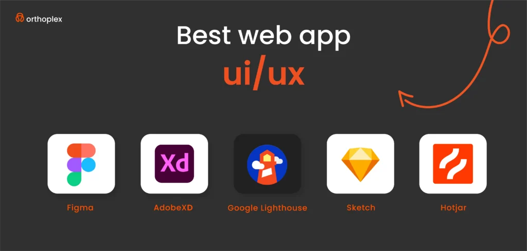
Top 5 Web App UI/UX Tools in 2025
The right tools can make or break your web app’s UI/UX, helping designers craft browser-friendly interfaces and businesses launch apps that keep users coming back.
These five stand out for their power, ease, and focus on web-specific needs, from prototyping to performance.
Here’s why these tools lead the pack, with real-world proof of their impact.
Figma
What It Does: Figma is a cloud-based design tool that’s taken over web app UI creation, letting teams build, prototype, and collaborate in real time, all in the browser.
Why It’s Great: Its flexibility shines for web apps, think responsive layouts that adjust from desktop to mobile with a click. The 2023 Design Census found 70% of designers rely on it, thanks to its unique features like auto-layout and dev handoff.
For You: Designers can save hours with shared libraries, update a button style once, and it syncs everywhere. Figma’s real-time collaboration cuts feedback loops, speeding up the process from concept to live.
Adobe XD
What It Does: Adobe XD is a powerhouse for designing and prototyping interactive web app experiences, with tight integration into the Adobe ecosystem.
Why It’s Great: It’s built for web-specific needs, drag-and-drop responsive grids, and test how a checkout flows across browsers. It helps to mock up fast-loading product pages, adding hover effects or transitions that mirror the live site. Adobe’s own data shows it cuts prototyping time by 30% with features like voice triggers, handy for future web trends.
For You: Designers can turn static designs into clickable demos. Also, they can benefit from its Creative Cloud sync, pair it with Photoshop for assets, to ensure a sleek web app launch.
Sketch
What It Does: Sketch is a Mac-based tool focused on pixel-perfect web UI design, churning out high-fidelity mockups for browser interfaces.
Why It’s Great: It’s lightweight and laser-focused on web visuals. Plugins like Craft let you test responsiveness across Chrome or Safari, and its vector tools nail typography and spacing. UX Design Institute notes Sketch still holds a loyal 25% of the design market for its speed.
For You: Designers get clean, export-ready files, perfect for solo pros or small teams. They can design polished UIs that translate straight to code, cutting development time.
Hotjar
What It Does: Hotjar tracks how users interact with your live web app, heatmaps, click tracking, and session replays, all in one.
Why It’s Great: It’s the eyes on your web app post-launch to see where users click, scroll, or drop off so tweaking can be based on real data.
For You: Post-launch, businesses can catch issues before they tank conversions, keeping their conversion flowing.
Google Lighthouse
What It Does: Lighthouse is a free, open-source tool from Google that audits your web app’s performance, accessibility, and SEO, right in Chrome.
Why It’s Great: It’s the gold standard for web optimization. Run it, and you’ll get scores on load time, plus fixes like image compression or lazy loading. It also flags WCAG gaps, keeping you compliant.
For You: Tweak assets for speed and improve bounce rates. It’s built into Chrome DevTools, businesses can run it weekly to keep their web app sharp and user-friendly.
Best Web App UI/UX Frameworks in 2025
Frameworks are the backbone of a great web app. They speed up development, ensuring smooth UX, and keeping UI sharp in the browser.
In 2025, these five stand out for building web apps that users love. They’re not just code libraries. they’re proven solutions used by top companies to deliver in a competitive online world.
Here’s why they’re the best, with practical details for designers and businesses.
React.js [Best for Dynamic Web Apps]
What It Is: React.js is a JavaScript library from Facebook that builds fast, interactive web app UIs with reusable components.
Why It’s Great: It’s perfect for dynamic web apps where content updates without reloading. Developers use React for its speed and flexibility, the virtual DOM keeps things snappy, even with heavy data. You can pair it with libraries like Material-UI for polished looks.
For You: Designers love the component system, build a button once, reuse it everywhere. Businesses get fast, engaging web apps that keep users hooked. It’s got a learning curve, but React’s docs make it doable, and the payoff is worth it.
Vue.js [Lightweight, Flexible]
What It Is: Vue.js is a progressive JavaScript framework that’s easy to pick up and scales from small features to full web apps.
Why It’s Great: It’s lightweight, less code bloat means faster loads, and flexible enough for GitLab’s clean, functional web app (gitlab.com). Stack Overflow’s 2023 survey ranks it among the top five frameworks, loved by 19% of developers for its simplicity and two-way data binding. It’s great for web apps needing quick updates, like project dashboards or forums.
For You: Designers tweak UI fast with Vue’s clear structure and can launch lean web apps without heavy overhead.
Tailwind CSS [Fast, Responsive Design with Utility Classes]
What It Is: Tailwind CSS is a utility-first CSS framework that lets you style web apps right in your HTML, no custom CSS needed.
Why It’s Great: It’s built for speed and responsiveness. It’s outpacing rivals, with devs praising its “write less, do more” approach. Forbes notes it cuts styling time by 40%.
For You: Designers prototype web UIs in hours, not days. It’s less opinionated than Bootstrap, so you control the look, just keep an eye on HTML clutter.
Bootstrap [Pre-Built UI Components, Great for Fast Development]
What It Is: Bootstrap is a CSS framework with ready-made components—buttons, forms, grids—for quick web app builds.
Why It’s Great: It’s a time-saver, for example, for responsive product pages that work across browsers out of the box. W3Schools calls it the most popular framework, with a massive community and docs. Its a 12-column grid ensures mobile-first UX, and pre-styled elements cut dev time.
For You: Designers tweak components fast and can launch web apps on tight deadlines. It’s less flexible than Tailwind but perfect when speed trumps customization.
Angular [Enterprise-Level Web Apps]
What It Is: Angular is a full-fledged framework from Google, built for complex, scalable web apps with TypeScript.
Why It’s Great: It’s the choice for enterprise heavyweights for robust, data-heavy UIs. Stack Overflow 2023 ranks it in the top 10, with 17% of devs using it for its structure, two-way binding, and dependency injection, which keep big apps manageable. It’s overkill for small sites but shines for intricate web apps like financial and b2b portals.
For You: Designers align with devs on structured UI to design reliable, large-scale web apps, like a manufacturer’s dashboard, that handle thousands of users.
These frameworks power the web apps you use every day. React and Vue bring flexibility, Tailwind and Bootstrap speed things up, and Angular tackles the big stuff. Designers, pick what fits your flow. And businesses, lean on these to deliver web apps that perform, scale, and keep users clicking.

The Web App UI/UX Work Funnel
Turning a web app idea into a live, user-friendly reality isn’t guesswork, it’s a process. This work funnel takes you from scratch to launch, ensuring your web app’s UI looks great and its UX keeps users in the browser. Each step builds on the last, blending design and strategy to deliver results.
Here’s how it works in 2025, with tools, examples, and real-world proof to guide designers and businesses alike.
Research & User Personas [Define Your Audience]
What It Is: Start by figuring out who’s using your web app and what they need.
How It Works: Dig into analytics, run surveys, and interview stakeholders to build user personas. Knowing your audience stops you from building blind.
Wireframing & Prototyping [Create Rough UI Drafts]
What It Is: Sketch the web app’s layout and flow, low-fidelity drafts to test ideas fast.
How It Works: Tools like Figma let you draw basic UI without polish. Wireframes focus on structure, while prototypes add clicks. Issues get caught early this way are cheaper than fixing later!
Design Phase [Develop High-Fidelity UI]
What It Is: Turn rough drafts into pixel-perfect web UI, colors, fonts, buttons, ready for browsers.
How It Works: Use Adobe XD for interactive polish or Sketch for precision. Add hover effects, responsive grids, and WCAG-compliant contrast (4.5:1).
Development & Integration [Implement UI in React, Vue, Angular]
What It Is: Code the UI into a working web app, hooking it to back-end systems.
How It Works: Pick a framework like React, Vue, or Angular. Ensuring buttons and layouts match the design. Test APIs early.
User Testing & Iteration [A/B Testing, Usability Studies]
What It Is: Test the live web app with real users, tweak based on what breaks.
How It Works: Run A/B tests. Does button A or B get more clicks? And run replays sessions to see where users stall on a checkout.
Launch & Optimization [Monitor User Behavior, Refine UX]
What It Is: Go live, then keep improving based on real-world use.
How It Works: Launch with monitoring. Refine based on data to keep users happy. Plan monthly updates to stay sharp.
This funnel isn’t rigid. It’s a cycle. Research shapes wireframes, testing refines design, and optimization keeps your web app alive.
Web App Accessibility & Compliance
Accessibility isn’t a checkbox for web apps, it’s a must-do that keeps your business safe, your users included, and your reputation strong. In 2025, a web app that ignores compliance risks, legal trouble, and shuts out potential customers. Here’s why accessibility matters for your web app, with clear reasons and fixes to get it right.
Legal Risks
Target, in 2019, it paid $6 million to settle a lawsuit because its web app (target.com) wasn’t accessible! Screen readers couldn’t navigate, leaving blind users locked out. For businesses this isn’t optional. A clunky web app could mean fines, legal fees, and a PR mess.
Inclusivity Wins
Accessibility isn’t just about avoiding trouble, it’s about reaching everyone. The CDC estimates 15% of people have disabilities. That’s millions of potential users who need features like screen reader support or high-contrast text. This is revenue on the table, it’s your chance to make a web app that works for everyone.
Practical Fixes
Getting accessibility right doesn’t have to be hard. Here are three key fixes that make a big difference:
Text Contrast 4.5:1 for Readability: Low contrast, like gray text on a light background, hides content from users with vision issues. WCAG 2.1 demands a 4.5:1 contrast ratio for readable text. Use tools like Contrast Checker to test. Aim for 16px fonts or higher, too. Keep forms and menus visible.
Alt Text for Images: Images without alt text, like a product photo or logo, are invisible to screen readers, leaving blind users lost. WCAG requires descriptive alt text. Write it short and clear (under 125 characters).
Keyboard Navigability: Some users can’t use a mouse so your web app needs to work with a keyboard. Hit “Tab” to move, “Enter” to click. Smashing Magazine found 10% of users rely on keyboards, and WCAG demands it.
These fixes are essential. Legal risks push you to act. However, 15% of your audience isn’t a niche.
Future Trends in Web App UI/UX (2025 and Beyond)
The web app landscape is shifting fast, and by 2025, UI/UX won’t just be about buttons and layouts. It’ll be smarter, more interactive, and built for how users live online. These trends are driven by tech advances and changing expectations.
Here’s what’s coming, with examples and proof of why it matters for web apps in North America and beyond.
AI-Powered Personalization
Personalization keeps users engaged. AI tailors web app experiences to each user, like recommendations or layouts that shift based on behavior, all in real time, making web apps feel custom-built.
Voice UI & Conversational Interfaces
Voice commands let users navigate web apps hands-free, powered by natural language processing. Smashing Magazine predicts 20% of web interactions will be voice-driven by 2025. NPR reports 40% of U.S. adults use voice daily. It’s hands-free UX in your browser. Designers, can test voice with Dialogflow to pair voice with clear UI cues for hybrid use.
Augmented Reality (AR) Integration
AR overlays digital visuals on the real world via web browsers, no app download needed. Designers can prototype with Three.js to design virtual tours.
Dark Mode Adoption
Adjustable UI themes, like dark mode, let users switch to low-light, high-contrast designs. Web.dev notes 70% of users prefer dark mode for comfort and battery savings on OLED screens. Designers can use CSS media queries (prefers-color-scheme) to build it.
Zero UI (Invisible Interfaces)
Interfaces fade away, replaced by gestures or voice! It’s the next step. Forbes says 25% of web apps will test zero UI by 2027, starting in 2025. Gesture swipes or voice commands cut screen clutter. Designers, experiment with WebXR for gestures. It’s niche now, but watch it grow aggressively.
These trends are here already, adopt them to stay ahead.
Measuring Web App UI/UX Success
You need to measure how your web app is working to know if it’s hitting the mark. Success isn’t just about launching, it’s about tracking what users do in your browser and tweaking based on data.
Here’s how to measure UI/UX success, with clear KPIs and proven tools to back it up.
Bounce Rate [Should Be Under 40%]
Bounce rate is the percentage of users who land on your web app and leave without clicking anything. A high rate like 60% means bad UI or slow UX.
Time on Page
How long users linger shows if your web app holds attention. For a SaaS tool like Slack, 2-3 minutes per page means they’re collaborating. Low time means your UI might confuse the users. So streamline flows to keep users active and engaged.
Task Success Rate
This measures if users finish what they came for, like buying, logging in, submitting a form. Nielsen says aim for 85% success rate.
User Feedback
Run surveys to get real users’ feedback. Use questions like: “How likely are you to recommend this web app?” on a 0-10 scale. Run it via SurveyMonkey post-task.
Best Tools for UX Analytics
Google Analytics 4 (GA4)
GA4 tracks how users move through your web app, bounce rates, time on page, conversions, all in real time.
Hotjar
Hotjar shows where users click, scroll, or stall with heatmaps and replays. It’s visual proof of UX flaws.
Crazy Egg
Crazy Egg runs A/B tests (e.g., red vs. green “Buy” button) and maps how far users scroll. Did they miss your call-to-action?
Tracking these KPIs with these tools turns guesswork into action.
Conclusion
Web app UI/UX isn’t a trend to watch, it’s the pulse of your online presence in 2025. Great UI/UX drives engagement, boosts conversions, and keeps users coming back. This isn’t optional, web apps with great UI/UX win markets; ones that lag, fade away. Designers, you’ve got the tools and process to lead. Businesses, prioritize UI/UX now, audit it, build it, refine it, and your web app will turn clicks into customers.