In a world where mobile screens are both the first and often only touch-point between brands. And their users, mobile-first design for businesses is about something much bigger than shrinking down a desktop experience. It’s about prioritizing what matters most to users on the go: creating interfaces that are intuitive, fast, and focused.
Below is a summary of what the essentials are in this Mobile-First Design for Businesses Guide. What it is, why it is important, and how you can actually put it into practice. From best practices to common pitfalls. Practical tools, and tracking techniques. We cover all that you need to make a mobile-first experience that isn’t just functional but keeps users coming back.
Let’s break it down into steps to help you make mobile-first designs shine and delight users. Forging meaningful connections across devices.
What is Mobile First Design for Businesses?
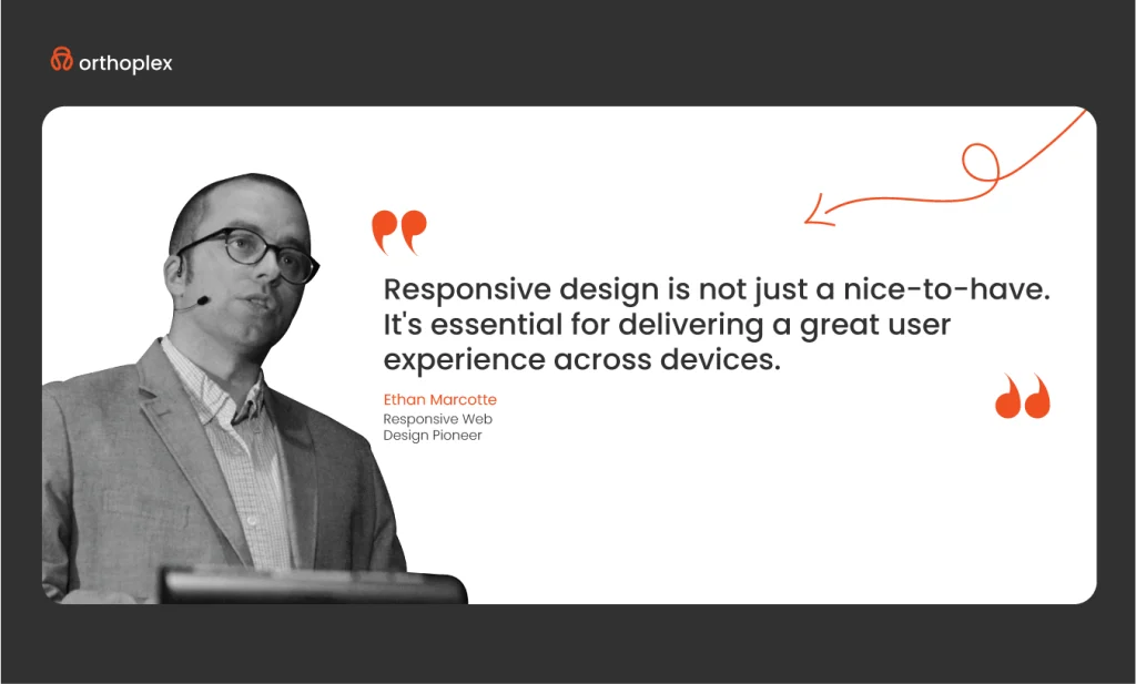
The phrase “mobile-first design” is pretty self-explanatory-it means that developers create for mobile users first. This technique starts by creating the mobile version of a product. And once perfected on small screens, builds out the features on bigger devices like tablets and desktops. Since space limits itself on mobile screens and operations are reduced. The approach makes designers work on what should form the core of the user experience; thus, a functional-intuitive product will arise straight from the very beginning.
Before we proceed further, let’s consider in greater detail a few key terms that will add weight to our understanding:
Responsive Web Design
Responsive web design is an approach to building websites wherein it automatically adjusts to different screen sizes. Whether users are on a smartphone, tablet, or desktop. The underlying content will automatically fit to the particular screen size of the device. This reduces unnecessary scrolling, zooming, and panning. Websites created with responsive design behave naturally across devices.
Graceful Degradation and Progressive Enhancement
Progressive Enhancement
This methodology begins with the most basic, enhanced version of the product for the lowest-end device. And focuses on the operational status of the most necessary functions. Refinements make progress to create versions for more advanced devices once the mobile experience has been realized. For example, they would have simple navigation on a mobile; when they proceed to the desktops, they might add hover effects or high-resolution images because that particular device supports that.
Graded Degradation
The opposite would be to start the design with the advanced version, usually for desktops, and then develop for mobile. In designing a website, one should start with a full-featured version on desktops. And take out elements that do not perform too well on smaller screens.
One of the reasons progressive enhancement is great is because it meets the need for mobile-first design for businesses. And means that core functionality gets captured early in design. For example, when starting with a desktop-first mindset, designers can sometimes create incomplete or compromised mobile experiences. Given the need to strip down features and elements from the design to make it functional.
If you’re still unsure why mobile-first design is crucial for your business, the following sections will help clarify its importance.
Mobile-First Design for Businesses: Why It’s Essential in Today’s Digital Landscape?
In today’s mobile-focused world, a mobile-first design approach isn’t a fad but rather a necessity. More than ever, individuals access the internet on mobile, and by designing for small screens, touch interactions, and unique constraints, mobile-first design shapes experiences that are clear, concise, and effective. Here are key reasons why mobile-first design became essential:
Mobile Usage Soars
With mobile internet usage constituting the bulk part of online traffic, making for a seamless mobile experience has become very critical to reach users of today. Predictions over previous years show that mobile access surpasses 70% of the total internet traffic, which consequently means brands have to adapt or risk alienating this great audience.
Cater to Mobile Constraints
Mobile devices have unique constraints: smaller screens, variable orientations, and lower processing powers compared to desktops. In mobile-first design, designers have to make very conscious choices as to what to display and allow the user to engage with other words, only the most important content and interactions are displayed, creating by default a leaner user experience.
Mobile-First Design for Businesses Improves SEO
Google and other search engines give a boost to mobile-friendly websites, watching their positions rise in search results. The mobile-first design for businesses will thus help to improve the SEO of a company, and visibility can increase accordingly, which may drive organic traffic.
Improves User Experience
As a rule, in mobile-first design for businesses, the developer provides for touch-based interactions, making the interface feel intuitive and easy to use on smaller screens. This also eliminates unnecessary steps and increases the completion rates of a task at hand, further improving the rates of user engagement and conversion.
Cost-Efficiency
It allows for scalability; thus, extending the design to bigger screens is pretty easy without rebuilding the entire UX. In this way, it saves time and reduces the cost of development, hence making the development process more efficient for longer periods.
In other words, mobile-first design for businesses is not just a reaction to the increased use of mobile devices but an active means to ensure access, engagement, and efficiency in any digital experience. Since mobile usage is going to prevail further, embracing mobile-first design for businesses will be what enables companies to remain competitive, ensure better SEO, and facilitate higher user satisfaction.
Sounds promising? Definitely—but now comes the real challenge: how to put the right strategies into action so that effective mobile-first design for businesses can be achieved.
3 Best Practices in Mobile-First Design for Businesses
With this, come some challenges. The following are the key practices that the development team needs to observe to ensure a website is meeting the requirements of mobile users. Here are some best practices to help you implement a mobile-first approach.
Prioritize Content
The “Content is King” mantra is true, now more than ever, with mobile-first design for businesses. Great content that’s pertinent to the user’s query will make your website found more often by a user, gain trust, and help your search ranking on such websites as Google or Bing. Make sure that on a mobile device, content is direct and to the point and provides what the user is looking for without clutter.
Navigation Should Be Intuitive
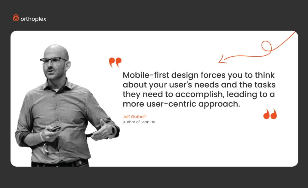
All of that clunky navigation confuses users and will definitely drive them away from mobile. Designing intuitive navigation, such as using navigation drawers or a simple sitemap, can make it much easier for users to interact with your website on a smaller screen smoothly. Clear and accessible navigation is key in moving users through your site.
With limited screen space, mobile users get pretty frustrated when there are unnecessary pop-ups or intrusive ads. Avoid the use of too many pop-ups to ensure a clean, user-friendly experience that will lead to better engagement and satisfaction.
Always Perform Beta Testing Before Launch
Testing on devices beforehand will help in having a smooth launch of your website. Beta testing on devices will point out the various flaws in the design that are to be rectified for smooth functionality while viewing on mobile, tablet, and desktop. This is important to ensure responsiveness and consistency of experience as expected by the user.
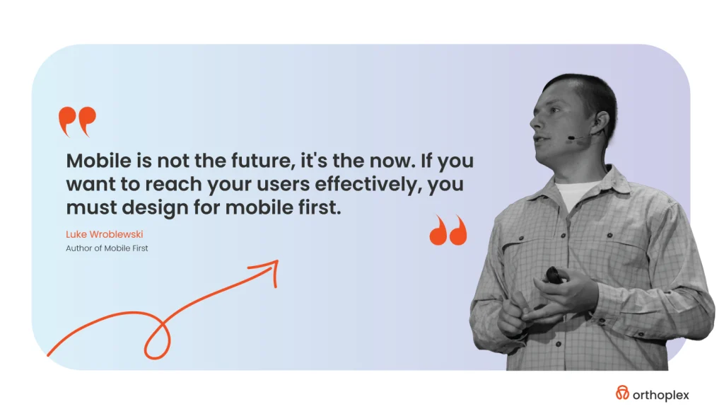
Mobile First leads to easy, engaging experiences across all devices and provides other extra advantages, listed below.
Benefits of a Mobile-First Design for Businesses Experience
Improved SEO
A mobile-first design for businesses will improve your website’s search engine optimization. Google happens to have a slight bias for websites that are mobile-friendly; thus, having a mobile-friendly website will give you a better ranking in searches for wider reach and higher conversion.
Easy Accessibility of All Mobile-First Design for Businesses
A mobile-first approach to design makes sites more accessible to persons with disabilities because the clear, responsive layouts are well-suited for small screens. It’s like a double solution. Mobile-first design for businesses thus creates a seamless experience that is more user-friendly to people with low vision or with other accessibility needs.
According to Statista, projecting 6.8 billion mobile users by 2023, mobile traffic growth is bound to rise. A mobile-friendly website will surely attract that audience and keep their attention with an experience they will always want to come back for.
Better User Experience
Emphasizing mobile, it goes without saying that your website will be designed keeping in consideration the input methods of touch, smaller screen sizes, and speed regarding page load. All this leads to an easy-to-operate experience across all devices; hence, assuring a better user experience.
Apart from a fresh look, the mobile-first site has faster and more accessible user experiences compared to other competitors. Businesses will be in an effective position to attract and retain customers by standing out in an increasingly mobile-centric market through mobile-first design for businesses.
Higher Conversion Rates As a Result to Mobile-First Design for Businesses
Since most of the online traffic flow these days is from mobile, a mobile-friendly design makes many improvements to conversion rates. You make it pretty simple for the mobile user to be your customer by appealing to them with smoother navigation and streamlined content.
A very important feature of such success is avoiding mistakes that could affect a responsive website design focusing on a mobile-first design for businesses approach. In developing websites to meet the mobile-first design level, we bring vast experience at Orthoplex Solutions by understanding the shifting currents in web design from a more desktop-focused approach, encompassing seamless experiences across devices.
Following are five common mistakes made in responsive web design, along with practical insights into their rectification:
Four Common Mistakes in Mobile-First Design for Businesses and How to Avoid Them
1. Lack of essential content on mobile
This could be an extremely tempting process just to have a clearer view on the mobile. However, it does run the risk of creating incoherence across the devices and can fragment a user experience. Alternatively, you can concentrate on priorities and structuring using responsive design methods, including accordions and content hierarchies. Important content is never shut out from what device is used according to Nielsen Norman Group, which is one of the key voices on user experience.
2. Failure to Consider Touch Interactions
Mobile users will use swiping and pinching gestures to navigate. If these are not considered, the site may appear unresponsive and annoy users. Mobile-first design for businesses should include touch-friendly buttons, swipe-able image galleries, and optimized spacing.
3. Designing Without Audience Insights
Designing without researching the needs of users creates generic solutions that usually fall flat. Audience research, device preference analysis, and usability testing will permit a design that truly resonates with your target demographic. Apply user analytics and build user personas to create design decisions via data as outlined in our past overview of user experience blog.
4. Not Testing for Devices and Browsers
Testing on different devices and browsers always results in performance that will degrade the user experience. Full testing will ensure every element of the design performs well across platforms. Utilizing real devices, emulators, and testing platforms like BrowserStack, compatibility issues will be found and addressed early on. For more, see BrowserStack’s guide to cross-browser testing.
Mobile-first design for businesses is not just a technical adjustment; it is also an alignment of design to user needs in a dynamic, mobile-first world. Orthoplex Solutions will assure one of a mobile-first website that adapts to all screens, hence boosting accessibility and engagement. You can check-out our range of works from here.
When you think of it, it can all sound amazing and helpful but there is nothing more helpful than the right set of tools for the right practical mobile-first design for businesses building.
Top Tools to Build a Responsive Mobile First Design for Businesses
The right set of tools is what one needs to get on with the job when designing a fantastic mobile-first responsive design. Orthoplex Solutions has compiled a few of the most powerful tools that will help in crafting exciting, easy-to-use, and responsive websites that stand up to today’s mobile-first requirements. All these tools can offer something different to each other-from designers’ solutions to the developers’ solutions in making their designing process easier and smooth.
1. Figma
Figma has quickly become a designer favorite, largely due to its team collaboration feature and frictionless browser-based workflow. This same real-time collaboration feature makes it one of the most wanted design tools for any design team, given that it can allow several designers and developers along with stakeholders to collaborate on the same project at the same time. This powerful prototyping capability was also included in this tool, which enables designers to build interactive mockups directly inside Figma.
The UI is pretty intuitive, and different plugin integrations do their magic with the workflows. Since Figma is web-based, it can be approached from any device, which in itself makes it perfect for cross-platform and responsive design. With Figma, designers will be enabled to shift their focus towards a mobile-first approach and see varied design work in various device sizes concerning accessibility and usability.
2. Adobe XD
In the second position, Adobe XD is great for UI/UX design and prototyping across both mobile and desktop. XD is tightly coupled with other offerings in the Adobe Creative Cloud. The designers can jump between Illustrator, Photoshop, and After Effects. In XD, you are also capable of adding responsive design capability to resize the elements automatically by screen size changes for consistency in layout across various devices. Then comes flexible prototyping; hence, you can add animations, transitions, and other interactive elements.
From a wide variety of plugins to integrations, the circle was completed with Adobe XD through collaborative tools that allow team members to share and give feedback in real-time on responsive projects.
3. Sketch
Sketch has for a long time been one of the favorite tools for UI and UX designers to make pixel-perfect designs, that translate smoothly into mobile and responsive layouts. Although it is a Mac-only tool, in Sketch you’ll find a rich library for keeping consistency between different screen sizes through symbols, styles, and libraries.
What puts it a cut above is the plugins and integrations ecosystem-like Zeplin for handoff and Anima for animations that add so much more depth to the design process. One of the peculiar features is Artboards in Sketch, which lets the designer review how their design will look on different devices and processes very much in line with mobile-first approaches. While by default, it is not a collaborative tool; through integration with cloud services, this tool has the capability for version control and sharing, thus making it suitable to work on mobile-first design for businesses by teams.
4. InVision Studio
InVision Studio is built for frictionless interactive prototyping and is highly appreciated for its animation and motion design capabilities. It’s truly powerful prototyping, including micro-interactions and transitions that can help bring to life a mobile-first design for businesses. The tool smoothly integrates into the workflow with InVision Cloud, enabling teams to collaborate in real-time and give feedback during the ideation process.
It also boasts a responsive layout feature through which designers can test and optimize their layouts across different device sizes. Freehand represents InVision’s digital whiteboard and is a great tool to help you brainstorm and share your ideas with your team. Therefore, it is worth trying out by those who take the mobile-first approach to design.
5. Axure RP
It is popular because it focuses on complex high-fidelity prototypes with conditional logic, dynamic content, and interactions. Axure RP provides a great platform in which to build deep, responsive designs that adapt to changing screen sizes and user interactions. Axure’s focus on form over function makes it a great fit for UXers who focus on the user journey and interaction with an app or website.
Axure RP lets one create wireframes for a mobile and desktop user experience. Axure helps teams create mobile-first prototypes that test different user flows. While Axure is not as visually oriented as Figma or Adobe XD, if your goal is to build data-driven interactive prototypes, Axure is simply the best. Making it a robust tool for building feature-rich responsive designs.
6. Framer
Framer closes the gap between design and code, thus helping designers make interactive prototypes that feel and look like real products. It has a component-driven approach, similar to coding in React. Additionally, it is super flexible for both web and mobile designs. Advanced interactions and animations make Framer an ideal choice for mobile-first design for businesses projects that require interactivity at a high level.
As an example
It can allow making swipe gestures in different directions, transitioning between custom screens, and so on. Framer also integrates with Figma and Sketch for seamless imports, adding layers of interaction. As for responsive design, Framer’s flexible grid and layout give the designer the capability to easily create layouts that will adapt seamlessly across device sizes. Since Framer supports more complex designs and animations, it’s also a great option for teams wanting to bring in dynamic responsive elements that elevate their mobile-first designs.
Each of the tools brings its strengths to responsive design. Figma and Adobe XD would be ideal in terms of collaboration, since both offer fantastic functionality for mobile-first design, while Sketch is good at maintaining consistent design, especially if one is on Mac. InVision Studio has advanced animations, though. Axure RP would suit high-fidelity prototypes with intricate interactions, while Framer allows one to add advanced interactions that could simulate a realistic final product experience.

The developers and designers can be assured that the responsive designs, with the inclusion of such tools, will keep in consideration the needs of the huge variance in mobile users while developing adaptive, accessible, and usable experiences. Incorporating these specialized tools into a mobile-first design strategy will truly enable designers and developers to create responsive websites that not only meet today’s user expectations but also enhance overall usability across all devices.
Are you in need of professional help?
Let Orthoplex Solutions Help You Go Mobile-First Design for Businesses
Mobile-first design for businesses is not a trend. But a real change that ensures users have seamless experiences on mobile, which has already taken over most web traffic. Orthoplex Solutions here comes to assist businesses in crafting intuitive, responsive websites for the usability of mobile-first. Be it optimization for faster load times, ensuring ease of navigation, or adapting visual elements to smaller screens. We know the peculiar challenges and requirements mobile-first brings about.
It all starts with an understanding of your users and the creation of a design. That works seamlessly on mobile and scales onto bigger devices. Using Figma, Sketch, and Adobe XD allows us to create device-sensitive layouts. That work fluidly across multiple devices so that every user can have a similar experience. Moreover, our team is well-versed in best practices such as touch-friendly interactions, efficient content prioritization, and testing compatibility for devices.
It all starts with an understanding of your users. And the creation of a design that works seamlessly on mobile and scales onto bigger devices. Using Figma, Sketch, and Adobe XD allows us to create device-sensitive layouts that work fluidly across multiple devices. So that every user can have a similar experience. Moreover, our team is well-versed in best practices such as touch-friendly interactions, efficient content prioritization, and testing compatibility for devices.
Orthoplex Solutions provides services that involve designing and creating an infrastructure to make the functionality seamlessly work on each device. Ensuring that mobile experiences are fast, responsive, and meet business objectives. Since it is given to adopt the mobile-first approach for a successful online venture nowadays. Let us at Orthoplex help you stay ahead with a mobile-optimized experience that users would love.
Final Thoughts
In summary, a mobile-first design for businesses’ philosophy is an absolute must in this current digital paradigm. This means that with the trend of mobile dominance of the internet landscape. It surely would guarantee that at least the most critical features and functionalities of the user experience would be captured. Through designing first for these platforms. This philosophy in design translates into leaner interfaces. Targeting users’ needs on the go, translating into faster load times and easy-to-navigate interactions.

